Prototyping with GenAI Tools - A Practical Guide for Data Product Managers
Data PMs face unique challenges: validating complex data relationships and schemas before building. This guide shows how to use GenAI tools to prototype data architectures, generate synthetic data, and test insights - condensing weeks of work into hours.
"In data product development, the cost of being wrong isn't just wasted time—it's wasted opportunity. With GenAI prototyping, we can now validate data assumptions in hours, not months."
Introduction
Data product managers face a unique challenge: efficiently validating complex data relationships, transformations, and visualizations without lengthy development cycles - you gotta build something of value that's sustainable too. GenAI tools are pretty cool i guess: allowing us to condense weeks of engineering effort into minutes. yea, that's nice
While general PMs benefit from faster UI prototyping and all of those fancy design sprints, DPMs can get something from these transformer supported tools too: the ability to validate complex data assumptions early. in this guide i'll share what i've seen work and you'll learn practical approaches to leverage GenAI for data product prototyping, with a focus on what makes our challenges unique
Why Prototyping Matters for Data Products
The Data Product Dilemma
Data products face a unique risk profile. Beyond the typical "Will users understand this interface?" question, data PMs must answer: "are we showing the right data?" "will these insights drive decisions?" "you sure about that chart there chad?!"
GenAI prototyping enables us to rapidly:
- Test visualization effectiveness with realistic data (hopefully realistic but that's on you too)
- Experiment with different data transformations
- Validate data schemas and relationships
- Simulate programmable interactions (API, connection protocols, or MCP actions these days)
A traditional PRD might specify: "The dashboard will show customer retention metrics with filters for segment and time period." But an interactive prototype reveals critical insights a static specification can't: Which visualization is clearest? What time granularity yields actionable insights? An interactive prototype answers these questions before committing to production code.
Key Challenges for Data PMs
unlike general PMs who focus primarily on interface elements, data PMs must address:
Data complexity: Data products involve relationships between multiple entities, transformations, and business logic that static mockups can't adequately represent.
Accuracy: A beautiful dashboard showing nonsensical data is worse than useless. Prototyping helps validate that algorithmic insights make sense.
Insight delivery: The biggest challenge is ensuring users understand and act on insights. Interactive prototypes reveal comprehension gaps that static designs miss.
📌 quick win: even a simple interactive data flow diagram built with GenAI can help stakeholders understand complex data relationships better than static documentation. ERD's only get you so far.
GenAI Prototyping Tools for Data Work
The GenAI prototyping landscape can be broken into three categories, each with specific strengths for data product work:
Chatbots (ChatGPT, Claude, Gemini, Grok, Deepseek)
- Best for: Quick data queries, generating sample datasets, simple code snippets
- Limitations: No persistent hosting, limited interactivity
- Data modeling strengths: Schema design suggestions, ERD generation, SQL DDL creation
- Real example: Using Claude to generate JSON datasets of customer transactions
Cloud IDEs (v0, Bolt, Replit, Loveable)
- Best for: Building interactive dashboards, mockable APIs, visualizations
- Data modeling strengths: Creating visual schema explorers, data lineage diagrams
- Top tool for data: Replit (excellent Python support for data work)
- Real example: Building a customer segmentation dashboard with filters and visualizations
Local Developer Assistants (Cursor, Copilot, Windsurf, Claude Code, Codex)
- Best for: Creating sophisticated data transformations, integrating with existing codebases
- Data modeling strengths: Generating migration scripts, building data pipelines, creating dbt models
- Limitations: Requires more technical knowledge
- Real example: Generating and refining synthetic data scripts
For data-specific work, each category has notable strengths. Chatbots excel at quick explorations and data generation but can't host interactive experiences. Cloud IDEs shine for end-to-end data experiences with persistent URLs for stakeholder feedback. Developer assistants offer the highest level of control for DPMs comfortable with code.

DPM insight: choose tools based on your prototype's data complexity, not just UI needs. simple dashboards work well in v0 or Bolt, but complex transformations might require Replit's Python capabilities.
Step-by-Step Workflows for Data Prototyping
From Design to Interactive Data Visualization
Process:
- Start with a dashboard design in Figma
- Extract the design into Bolt or v0
- Add interactive elements using realistic data
- Test with various data scenarios
Key Example: When prototyping a customer lifetime value dashboard, I took a screenshot of our Figma design and asked Bolt to recreate it:
Create a React dashboard that matches this design. It should have a header,
summary metrics showing total customers, average LTV, and retention rate,
and a main area with a bar chart showing customer value by segment.
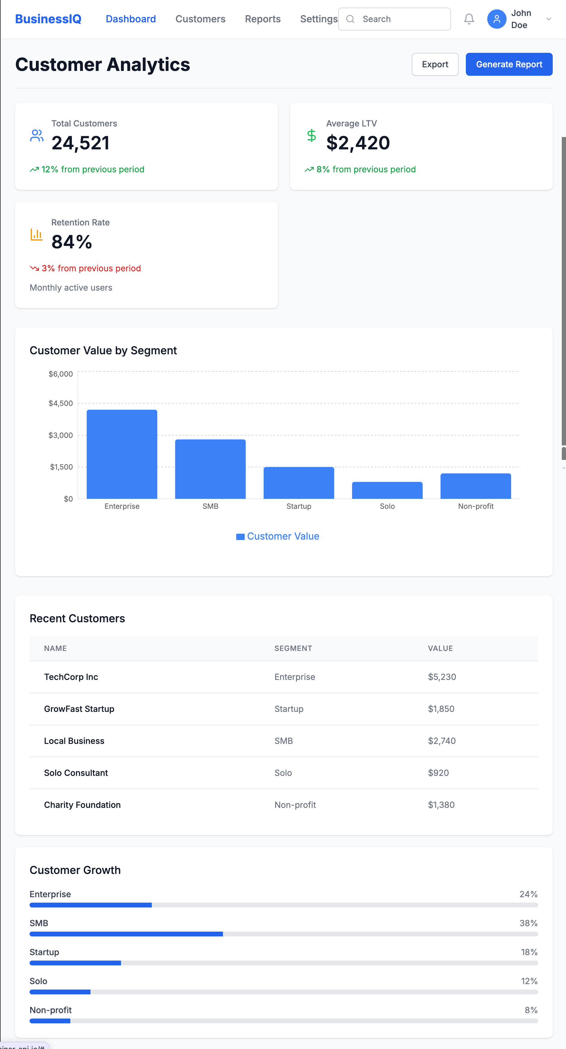
Then added interactivity:
Make the dashboard interactive with:
1. A date range picker that updates all metrics
2. Clickable segments showing detailed breakdowns
3. A CSV upload button for custom data visualization
This quickly revealed insights we'd missed in the static design:
- Users wanted side-by-side segment comparisons
- Year-over-year comparisons were essential
- Data validation for uploads was critical
From PRD to Data-Driven Prototype
Process:
- Extract key data entities from your PRD
- Define mock data schema using an AI assistant
- Build a functional prototype in a cloud IDE
- Test with real users to validate assumptions
Key Example: For a Sankey plot, I first used Claude to define a data schema that would support denormalized EHR data in a wide format. Then built a prototype in Replit that allowed toggling between schema orientation and it was able to implement rough Plotly visuals for this
The prototype revealed critical insights:
- Users were confused by attribution model differences
- We needed to visualize the customer journey alongside attribution
- Teams wanted to see how changing the attribution window affected results
For data products, the proof is in the insights. Focus your prototype on validating that users can understand and act on the data you're providing.
Generating Synthetic Data with GenAI
One critical aspect of data prototyping is generating realistic synthetic data. GenAI tools excel at:
- Volume & variety: Creating thousands of records with appropriate variations
- Format flexibility: Generating data in JSON, CSV, or SQL formats
- Pattern matching: Mimicking statistical distributions with the right prompting
- Range support: building with ranged and IQRs
However, they struggle with:
- Relational integrity: Maintaining consistency across related tables
- Domain accuracy: Ensuring specialized data (medical, financial) reflects real constraints
- Edge cases: Generating unusual but important scenarios
- Logical reliability: continuing that trend of relational extension through iterations
- Outlier building: Developing realistic and unrealistic outliers based on trajectories. For example, in marketing ad spend, a ROAS 10x the avg makes sense dependent on your Monthly Allocated Spend for small brands and scales negatively with budget - ad platforms flag this all the time but it happens!
Here's a sample prompt for limited synthetic data I used a couple of months ago:
Generate a synthetic healthcare claims dataset for prototyping, using open source standards.

Requirements:
- Use the HL7 FHIR Claim resource (or OMOP CDM’s visit_occurrence and drug_exposure tables) as the data model.
- Include 1,000 claims for 200 unique patients over a 12-month period.
- Each claim should have:
  - Patient ID (de-identified)
  - Provider ID
  - Service date
  - Diagnosis codes (ICD-10, 1-10 per claim)
  - Procedure codes (CPT, 0-5 per claim)
  - Drug codes (NDC or RxNorm, if applicable)
  - Total billed amount and paid amount
  - Payer type (Commercial, Medicare, Medicaid)
  - Claim status (Paid, Denied, Pending)
- Ensure realistic distributions (e.g., 70% Commercial, 20% Medicare, 10% Medicaid; 85% Paid, 10% Denied, 5% Pending).
- Vary service dates, codes, and amounts to reflect real-world patterns.
- Output as a CSV or JSON array, with field names matching the FHIR Claim resource (or OMOP table columns).
- Do not include any real patient data—generate all values synthetically.

Optional: Add a few edge cases, such as claims with unusually high amounts, missing diagnosis codes, or denied status due to invalid procedure codes.
key takeaway: the quality of your prototype is directly linked to the quality of your synthetic data. invest time crafting realistic data scenarios that include edge cases > get good at evals (I'll write more about that later but check this out for now --— Beyond vibe checks: A PM’s complete guide to evals
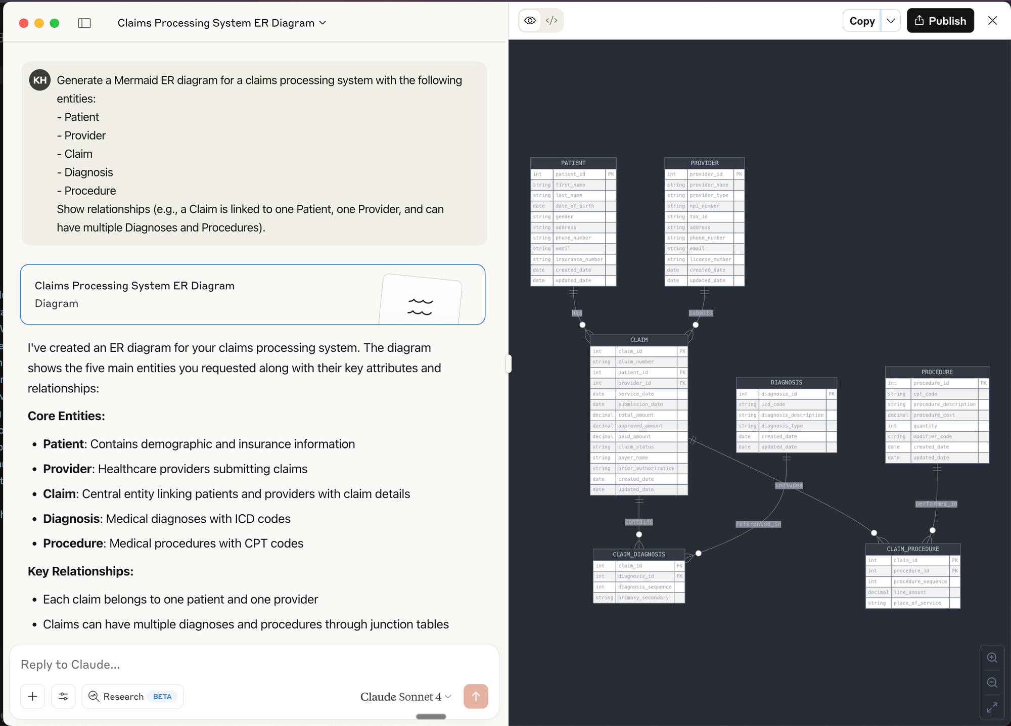
Diagramming & Data Flow Tools (e.g., Mermaid, dbdiagram.io, Lucidchart)
Best for:
- Visualizing data models, entity relationships, and data flows before building
- Communicating architecture and logic to both technical and non-technical stakeholders
- Rapidly iterating on schema or pipeline designs
How to use:
- Use tools like dbdiagram.io to quickly sketch ERDs (Entity Relationship Diagrams) for your data models.
- Use LLM chat interfaces to create Mermaid diagrams (supported in many markdown editors and wikis) to generate flowcharts, sequence diagrams, and even Gantt charts directly from text prompts.
Prompt Example for Mermaid:
Generate a Mermaid ER diagram for a claims processing system with the following entities:
- Patient
- Provider
- Claim
- Diagnosis
- Procedure
Show relationships (e.g., a Claim is linked to one Patient, one Provider, and can have multiple Diagnoses and Procedures).
Prompt Engineering for Data Prototyping Success
The quality of your prompts directly impacts prototype quality. For data work, follow this framework:
Reflection: Start by asking the AI to analyze requirements before writing code.
Based on this data schema, what potential issues should I watch for when designing
a time-series visualization? Consider null values and sparse data periods.
Batching: Break complex data tasks into smaller components.
Let's build this dashboard in stages:
1. First, define the data model
2. Next, create the aggregation logic
3. Then build the visualization component
4. Finally, add filtering capabilities
Specificity: Be precise about data structures and transformations.
Generate a histogram showing user session lengths. The data will be:
[{ "session_id": "s12345", "duration_seconds": 320, "page_views": 4 }, ...]

Group durations into 30-second buckets with tooltips showing count and range.
Context: Provide business context and examples.
In hospital EHR data, friday night visits to ED are typically 30% higher than weekdays, and
morning hours (0730-1100) see peak traffic. Generate sample data matching these patterns.
Common pitfalls to avoid:
- Underspecifying data formats: Vague requests lead to outputs that don't match your needs
- Unclear relationships: Specify how entities relate (one-to-many, etc.)
- Vague data requirements: Include specific distributions, ranges, and business rules
Real-World Case Studies
Rapid Dashboard Prototype for Stakeholder Alignment
Challenge: Our team needed buy-in for a new customer health score methodology.
Approach: Created an interactive dashboard in v0 where stakeholders could adjust factor weights and see how scores changed for different customer segments.
Result: Instead of weeks of theoretical debate, we achieved alignment in two days. Stakeholders discovered we needed to normalize scores by customer size—something we would have missed without the interactive experience.

Validating a New Data-Driven Feature
Challenge: We hypothesized users would value a new "composite symptom" metric against multiple scales in our healthcare dataset.
Approach: Built a Replit prototype that allowed users to:
- View their simulated score
- See the calculation methodology
- Explore how behavior changes would affect their score
- Compare against benchmarks
Result: We discovered:
- Users valued the concept but needed more contextual information
- Comparisons to similar users mattered more than absolute scores
- The term "efficiency" confused users; "productivity impact" resonated better
- Users wanted actionable recommendations based on the score
These insights saved months of development on a feature that would have missed the mark.
Actionable Takeaways for Data PMs
Tool Selection Framework
Use chatbots for:
- Quick data exploration
- Simple data generation
- Single-use code snippets
Use cloud IDEs for:
- Shareable interactive prototypes
- Data visualizations with filtering
- End-to-end simulated experiences
Use developer assistants for:
- Complex data transformations
- Integration with existing code
- Production-quality implementations
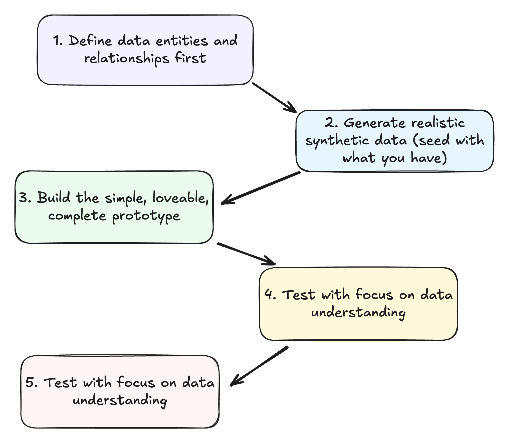
The Data Prototype Workflow
- Define data entities and relationships first
- What objects comprise your data model?
- How do they relate to each other?
- Generate realistic synthetic data
- Include common patterns and edge cases
- Ensure data reflects business realities
- Build the minimum viable prototype
- Focus on validating key assumptions
- Make it just interactive enough to test your hypothesis
- Test with focus on data understanding
- Can users derive meaningful insights?
- Do they understand what metrics mean?
- Iterate based on data value feedback
- Refine the data model based on insights
- Adjust visualizations to better communicate meaning
De-risking Data Products Through Prototyping
Leverage GenAI prototypes to validate:
Data assumptions: Test whether your understanding of the data is correct before building.
User value: Confirm insights actually solve user problems in a meaningful way.
Technical feasibility: Verify your proposed architecture will work as expected.
Stakeholder alignment: Build consensus through interactive demonstrations that make abstract concepts tangible.
success story: "We used to spend 3 weeks building data visualization prototypes. With GenAI tools, we reduced that to 2 days, and the quality of feedback improved because stakeholders could interact with real data." - VP Data, Health System

Further Resources & Next Steps
Learning Resources:
- Streamlit Documentation - For building data apps in Python/replit
- Observable - Interactive data visualization playground
- "Storytelling with Data" by Cole Nussbaumer Knaflic
- GenAi prototyping for product managers
- Anthropic - prompt engineering overview
- Ideo - Prototyping Overview
- Beyond vibe checks: A PM’s complete guide to evals
Take Action Today:
- Create a simple dashboard prototype using v0 or Bolt
- Practice generating synthetic data with Claude or ChatGPT
- Share your prototyping experiments with your team - don't be afraid but yes, they might laugh at you